 English
 Deutsch
 Polski
 Română
 Čeština
 Melayu
 Bahasa Indonesia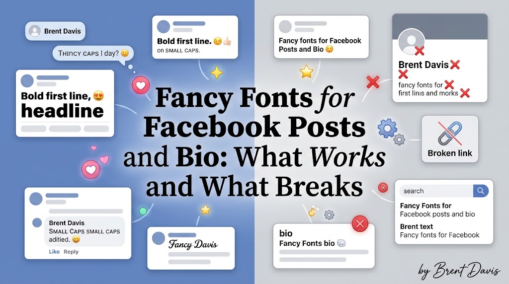
Why Fancy Fonts for Facebook Catch the Eye
Your Facebook feed moves fast. Most people scroll past a post in about a second unless something makes them stop, and a line of bold or cursive text can do exactly that. That’s the main reason fancy fonts for Facebook have become so popular with small shops, page admins, and regular users who want their birthday posts to look a bit special. Facebook, however, doesn’t give you any font options in the normal post box. You can’t pick a typeface, you can’t make one word bold with a button, and there’s no italics key either. So people use Unicode styled text instead. These are special characters that look like bold, italic, script, or bubble letters, and they paste into Facebook just like normal text. Because they’re real characters and not a font setting, your friends see the same style on their phones and laptops. Honestly, I think they work best in small doses. A bold first line on a long post helps people see what it’s about before the “See more” link cuts it off. A cursive name in a caption feels warm and personal. On the other hand, a whole post written in fancy letters is tiring to read, and some people will skip it. There’s also a catch that surprises many users: fancy fonts don’t work everywhere on Facebook. Your profile name, for example, has strict rules, and styled letters will usually get rejected. Throughout this guide, you’ll learn where these fonts work well, where they break, and how to use them without hurting how people read or find your posts. You’ll also see simple steps for posts, comments, your bio, and Pages. By the end, you’ll know exactly where styled text belongs on Facebook and where plain letters are still the smarter choice.
How Fancy Text Actually Works on Facebook
Before you paste anything, it helps to understand what’s going on under the hood. Every letter you type is a character with its own code in a giant shared list called Unicode. The normal “A” has one code, while the bold “��” has a completely different one. That bold version comes from a block called Mathematical Alphanumeric Symbols, which was first made for math formulas. Fancy text tools take each letter you type and swap it for its styled twin from these blocks. Because of that, Facebook doesn’t see “bold text”. It simply sees a string of unusual characters, stores them, and shows them to your friends. Their phone or computer then draws those characters using its own system fonts. Most modern iPhones, Android phones, and Windows PCs handle them well, so the style usually looks right. Still, there are some quirks you’ll only notice after using these styles for a while. For example, in the plain script alphabet, capital B, E, F, H, I, L, M, R and lowercase e, g, o come from an older Unicode block called Letterlike Symbols. As a result, on some phones those letters look a little thinner or sit slightly higher than the rest of the word. It’s small, but in a name like “Bella” you can sometimes spot it. Numbers are another gap. Script and cursive styles have no matching digits, so any numbers in your text stay plain. Meanwhile, screen readers, which blind users rely on, often read styled letters strangely or skip them entirely. Facebook’s own search also looks for normal letters, which means a word written in fancy text won’t show up when someone searches for it. In short, these styles are just characters dressed up to look like fonts, and knowing that helps you use them in the right places on Facebook.
Step-by-Step: Adding Fancy Fonts to a Facebook Post
Now let’s get to the practical part. Adding styled text to a post takes less than a minute, and it works the same way on the Facebook app and in a desktop browser. The only thing you need is a tool that turns your normal text into styled characters. After that, it’s just copy and paste. Here’s the full process:
- Open a font tool in your browser and type the words you want to style.
- Scroll through the results and pick a style that’s easy to read on a small screen.
- Tap or click that style to copy it.
- Open Facebook and start a new post, a comment, or a caption on a photo.
- Paste the styled text where you want it, then type the rest of your post in normal letters.
- Check the preview and tap Post.
That’s it. However, a couple of habits make a big difference. First, style only the opening line or one key phrase. Facebook cuts long posts after a few lines and adds a “See more” link, so a bold first line acts like a headline. Second, avoid styled text in the part people might search for later, such as a product name or an event title. I prefer to write something like a bold “Sale Starts Friday” as the first line and keep the details, prices, and address in plain letters underneath. Similarly, if you’re posting on a colored background, keep it short, since Facebook only allows those backgrounds on short posts of around 130 characters. Once you’ve posted, open it on your phone as well as your computer. Styled letters can look larger or smaller than expected next to normal text, and a quick check lets you edit the post before too many people see it.
Where Fancy Fonts Work on Facebook and Where They Break
This is the part most guides skip, and it’s the one that causes the most frustration. Styled text works in some Facebook spots without a problem, yet it gets blocked or causes trouble in others. Posts, comments, photo captions, and group posts all accept Unicode characters, so your fancy text will show up fine there. Your profile name is a very different story. Facebook’s name standards don’t allow symbols, unusual characters, or odd capitalization in personal names, and styled letters fall into that group. So if you try to change your name to a cursive version, Facebook will usually refuse it or flag it for review. Even when a name change goes through, you can only change it again after 60 days, which makes experimenting risky. Page names face a similar review, so a styled business Page name may get rejected too. Your bio, which Facebook calls your Intro, is more relaxed. It accepts styled characters, but it only gives you 101 characters, so every symbol counts. Pretty styles from a pretty fonts collection look lovely there, as long as you keep them short. Messenger is also fine for styled text, since it’s just another text box. Marketplace listings are where I’d be careful. Buyers search for plain words like “sofa” or “iPhone 13”, and a styled title simply won’t match those searches. That means fewer people see your listing. Ads are similar. Facebook reviews ad text, and heavy use of unusual characters can make an ad look spammy. Personally, I’d never use fancy fonts in an ad headline. In short, think of styled text as decoration for things people read, not for things people search or things Facebook reviews. Keeping that simple rule in mind saves you from rejected names, hidden listings, and posts that don’t reach the right people.
Best Fancy Font Styles for Facebook Posts and Bios
Not every style suits Facebook. Some look great in a generator and then feel awkward next to photos, reactions, and long comment threads. Facebook’s own font is clean and simple, so styles that stay close to normal letters usually blend in best. From regular use, here are the styles that tend to work well and where to use them:
- Bold sans (��������): the most readable choice for headlines and first lines of posts.
- Bold serif (��������): a bit more formal, good for announcements and quotes.
- Italic (������������): works well for quotes, song titles, or a softer tone.
- Script or cursive (������������): pretty for names and wishes, but hard to read in long text.
- Small caps (ꜱᴍᴀʟʟ ᴄᴀᴘꜱ): subtle and neat for short bio lines.
- Circled or bubble letters (Ⓑⓤⓑⓑⓛⓔ): fun for one word, never a full sentence.
- Strikethrough (S̶t̶r̶i̶k̶e̶): useful for showing old prices next to new ones.
As a general guide, bold sans is my go-to on Facebook. It’s clear on every screen, and it works for both personal posts and business pages. Script styles are lovely for a wedding anniversary post or a child’s birthday wish, but I’d keep them to a name or a short line. Also, pay attention to strikethrough. It looks clever for price drops, yet some older phones show the strike line slightly off the letters, so check it on your own device first. Glitch or “Zalgo” text is one style I’d avoid completely. It stacks marks above and below each letter, spills over nearby text, and looks like spam. Upside-down text has a similar problem, because people have to tilt their heads to read it. Finally, mixing emoji with styled text can work nicely. A single heart or star before a bold line looks tidy, and you can grab clean symbols from an emoji copy and paste library instead of hunting through your keyboard.
Using Fancy Fonts on a Facebook Business Page
If you run a Facebook Page for a shop, a salon, or a local service, styled text can help your posts look more polished. Still, business posts need a lighter touch than personal ones, because your goal is sales and trust, not just looks. Start with your post structure. A bold first line works like a mini headline, for instance “������ ������������ �������������������� ���� ��������”, followed by plain text with the details. Customers can scan the headline quickly and then read the rest if they’re interested. Next, keep important information plain. Prices, phone numbers, addresses, and website links should always be in normal letters. Otherwise, screen readers may skip them, customers can’t copy them easily into a map or dialer, and Facebook’s search won’t find them. Moreover, think about your About section. It accepts styled characters, but I’d use them only for a short tagline, not your contact details. Consistency matters too. If your Instagram uses a certain bold style for announcements, use the same style on Facebook, so followers recognize your brand across both. Another thing to watch is your Page name. As mentioned, Facebook reviews Page names, and a styled name may be rejected or changed. Keep your official name plain and add style in your posts instead. Here’s an honest limitation you should know: styled text won’t magically boost your reach. Facebook’s feed decides what to show based on how people interact with your posts, not on the font you use. A styled headline can make someone stop scrolling, but only good content keeps them reading and commenting. So, treat fancy fonts as packaging. They help your message get noticed, but the message itself still has to be worth reading, whether it’s a sale, a tip, or a behind-the-scenes photo.
Fixing Common Problems With Fancy Fonts on Facebook
Even when you follow every step, a few problems pop up often. The most common one is empty boxes or question marks instead of letters. This happens when someone’s device doesn’t have a font that includes those characters. Older Android phones and some budget tablets are the usual cause. You can’t fix their phone, of course. So, if your audience includes many older devices, stick with bold sans, which has the widest support. Another issue is a name change that won’t go through. If Facebook says your name doesn’t follow its standards, the styled characters are almost always the reason. Go back to plain letters, since there’s no reliable way around this rule. Sometimes the text also looks different after posting. Facebook uses slightly different fonts in its app and on the web, so script letters might look thicker in one and thinner in the other. That’s normal, and it isn’t something you can control. Pasting can fail too, especially on mobile. If nothing appears, or only part of your text shows, try pasting into your phone’s notes app first, then copy it again from there. That usually clears out hidden characters. Also, some keyboards try to “fix” styled letters by changing them back to normal ones while you edit. Turning off autocorrect for a minute stops that. Another common complaint is that a post with styled text doesn’t show up in search. That’s expected, because Facebook’s search reads normal letters. The fix is simple: include the important word in plain text somewhere in the post. Finally, if your comment gets hidden or marked as spam in a group, the group’s admin may have filters against unusual characters. In that case, respect the group rules and switch back to plain text for that community.
Tips for Using Fancy Fonts on Facebook the Smart Way
Once you know the rules, you can use styled text in a way that looks good and still feels natural. Start with one clear goal for each post. Ask yourself what you want people to notice first, then style only that part. For a birthday wish, it might be the person’s name. For a lost pet post, it might be “Missing Dog”, while the area and phone number stay plain. Next, respect the length limits. Your bio has 101 characters, and colored background posts only hold short text, so every styled letter needs to earn its place. Then, think about your audience. Younger friends might enjoy bubble letters and sparkles, whereas family members on older phones will be happier with simple bold. Moreover, save your favorite styles somewhere handy. Keeping a note on your phone with a few ready-made styled phrases means you won’t have to regenerate them every time. I’ve also found that testing matters more than people expect. Before a big announcement, post a test comment on your own post, check how it looks on your phone and laptop, then delete it. Furthermore, keep accessibility in mind. Around the world, many people use screen readers, and styled text can turn your post into gibberish for them. That’s another reason to keep key details plain. Consistency is worth a thought as well. If you style your name the same way across Instagram, TikTok, and Facebook posts, people start to recognize your look. You can type your text once into a free font generator, compare a few styles side by side, and pick one signature look to reuse. Finally, don’t overdo it. One styled line per post is usually enough to stand out, and it keeps your feed looking clean instead of cluttered.
Final Words
Fancy fonts for Facebook are a simple way to make posts, comments, and your bio stand out, and they only take a copy and a paste. The trick is knowing where they belong. They work well in posts, comments, captions, Messenger, and short bio lines. They break in profile names, can hurt Marketplace listings, and don’t help ads or search. Keep important details in plain letters, use one styled line at a time, and check how it looks on more than one device. Follow that, and your posts will catch the eye without becoming hard to read or hard to find.
FAQs
Can I use fancy fonts in my Facebook name?
Usually not. Facebook’s name standards don’t allow symbols or unusual characters, so styled names are typically rejected. Use them in your posts or bio instead.
How long can my Facebook bio be?
Your Facebook Intro bio allows up to 101 characters. Styled letters and emoji count toward that limit, so keep it short.
Why do my fancy fonts show as boxes for some friends?
Their device doesn’t have a font that supports those characters. Bold sans styles have the widest support and show correctly on most phones.
Do fancy fonts hurt my Facebook reach?
The font itself doesn’t change reach, but styled words aren’t searchable. Keep key words plain so people can still find your post.
Can I bold text in a normal Facebook post?
Facebook has no bold button for regular posts. The easiest way is to paste Unicode bold text created with a font tool.